So it is with much deliberation and research, I present to you some examples of good and bad applications of hypermedia.. starting with the bad.
Bad examples:
- MTA's former website
I was going to use the website as an example of bad applications of hypermedia but imagine my surprise when I logged on earlier this weekend to see that they revamped it! The old website was difficult to find the page or link you were looking for as it varied from page to page.
- My brothers' former elementary school's website


This is not a functional website for several reasons. First of all, it is meant to be a website to inform parents yet it has not been updated in the past year. Secondly, the site does not make use of most of the page. Everything is centered and haphazardly thrown together, like someone googled graphics that seemed relevant and put it on the page. There is no consistency and some graphics are off-center. Parents and students alike have complained about the lack of information and functionality of the site.
- Cool Math Games
 If you are viewing this lovely website on Internet Explorer or Firefox, you will find a series of geometric shapes following your cursor across the page. That is, if you can get over the black background and neon letter contrast. Although this site has many fun games for students, the color scheme takes some getting use to. All that color can be quite distracting when you are trying to play a game. Additionally, it is difficult to tell which are links in the header. This site is very text-heavy considering it is a website for math games.

Good examples:
- Stuyvesant High School
 Now, I may be partial as this is my alma mater but this website has only improved over the years. It is informational and the links are easy to see and navigate. In addition, the links in the header are consistent from page to page making it easy for one to navigate from one page to the next. The flash on the home page is simple yet gives you a glimpse of what the school facility is like. This is an example of a functional and informative school website. The sections are clearly labeled and distinguished so it is easy to glance over to the part you wish to read.

- World Vision
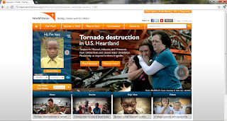 From a quick glance, you can locate where you wish to go on this site. Everything you wish to navigate to or read can be found on the screen without having to scroll down. The color contrast of the text stands out in a way that is not hard on the eyes.

- PBS Kids
 For children's website, this site is very kid-friendly. It does not require a child to be able to read in order to know how to navigate around the page. The visuals are not too overwhelming. There is no scrolling required to view everything on the page. The links at the bottom could use a bit more contrast to stand out but for a children's website, it is not necessary. There is a video that begins to play soon after the page has loaded. While there isn't a pause button nor is there a mute button, it does not last long and serves its purpose for children who are not yet able to read. [It is for the "videos" link.]

Wow, what a great post. It's interesting to notice the subtle ways that sites differ which make them good and bad. User experience seems to be lost on some designers and it's always appreciated when it's not lost.
ReplyDeleteGreat blog! Thanks for generously sharing such valuable information. Keep up the fantastic work!
ReplyDelete